views bank
views bank
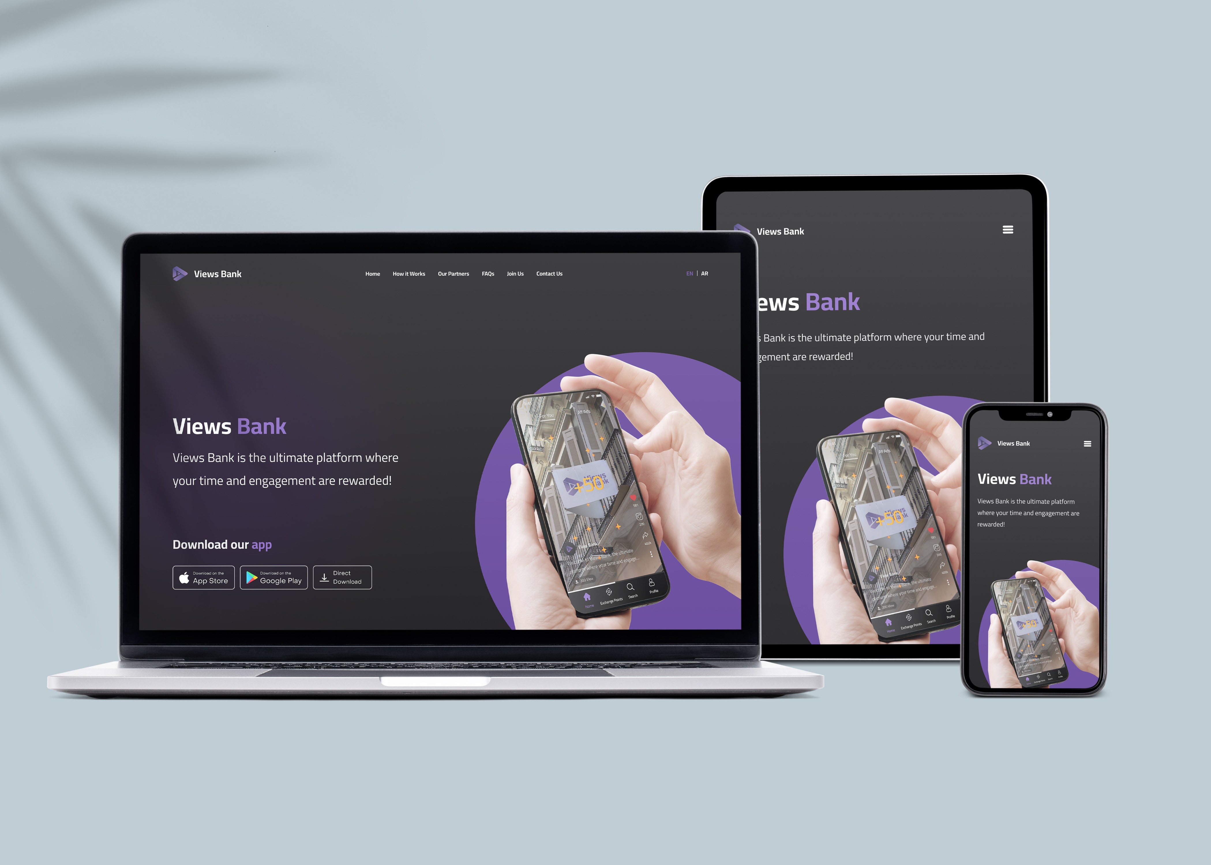
This is a landing page for views bank an app that gives users points for watching videos, which they can then exchange later for rewards
Project Overview
Project Overview
The project centered on designing a landing page for an innovative app that rewards users with points for watching videos. The objective was to create a visually compelling interface that not only captivates users but also seamlessly aligns with the app's established visual identity. This approach ensured that users could easily recognize the app and feel a sense of continuity from the landing page to the app itself.
The project centered on designing a landing page for an innovative app that rewards users with points for watching videos. The objective was to create a visually compelling interface that not only captivates users but also seamlessly aligns with the app's established visual identity. This approach ensured that users could easily recognize the app and feel a sense of continuity from the landing page to the app itself.
Project Overview
The project centered on designing a landing page for an innovative app that rewards users with points for watching videos. The objective was to create a visually compelling interface that not only captivates users but also seamlessly aligns with the app's established visual identity. This approach ensured that users could easily recognize the app and feel a sense of continuity from the landing page to the app itself.
Design Process
Design Process
The design process prioritized creating a clean, visually appealing layout that harmonized with the app's branding elements, such as color schemes, typography, and imagery. We adopted a user-centered approach, emphasizing intuitive navigation and compelling calls-to-action to guide users through downloading the app and partners through joining us.
The design process prioritized creating a clean, visually appealing layout that harmonized with the app's branding elements, such as color schemes, typography, and imagery. We adopted a user-centered approach, emphasizing intuitive navigation and compelling calls-to-action to guide users through downloading the app and partners through joining us.
Design Process
The design process prioritized creating a clean, visually appealing layout that harmonized with the app's branding elements, such as color schemes, typography, and imagery. We adopted a user-centered approach, emphasizing intuitive navigation and compelling calls-to-action to guide users through downloading the app and partners through joining us.
Responsive Design and Accessibility
Responsive Design and Accessibility
Given the diverse user base of the app, ensuring that the landing page was responsive across different devices was a top priority. I designed the page with mobile-first principles, ensuring an optimal experience on smaller screens without sacrificing functionality or aesthetics. Additionally, accessibility was a key focus — I incorporated best practices such as clear typography, high-contrast color schemes, and optimized alt text for images, ensuring users with different abilities could interact with the page seamlessly.
Given the diverse user base of the app, ensuring that the landing page was responsive across different devices was a top priority. I designed the page with mobile-first principles, ensuring an optimal experience on smaller screens without sacrificing functionality or aesthetics. Additionally, accessibility was a key focus — I incorporated best practices such as clear typography, high-contrast color schemes, and optimized alt text for images, ensuring users with different abilities could interact with the page seamlessly.
Responsive Design and Accessibility
Given the diverse user base of the app, ensuring that the landing page was responsive across different devices was a top priority. I designed the page with mobile-first principles, ensuring an optimal experience on smaller screens without sacrificing functionality or aesthetics. Additionally, accessibility was a key focus — I incorporated best practices such as clear typography, high-contrast color schemes, and optimized alt text for images, ensuring users with different abilities could interact with the page seamlessly.

More Works More Works
More Works More Works
ghaid alhamwi
©2024 ghaid alhamwi
GO BACK TO TOP
©2024 ghaid alhamwi
GO BACK TO TOP
©2024 ghaid alhamwi
GO BACK TO TOP
©2024 ghaid alhamwi
GO BACK TO TOP